Cash App
Dispute Flow
This case study redesigns the dispute flow from entry to resolution, replacing a system of dead ends and silence with one built on transparency, guidance, and trust.
The Problem
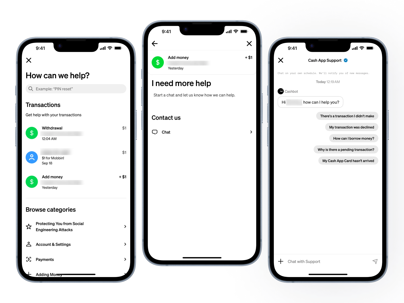
Users facing disputed transactions had no clear path forward. Confusing entry points, opaque status updates, automated denials with no reasoning, and no escalation path left them financially exposed and contacting support repeatedly, only to be met with the same bot that started the cycle.
No Visible Entry Point
The dispute option is buried behind a contextual menu that stressed users don't discover. Most users never find it on their first attempt.
Silence After Submission
Submitting a dispute produces no confirmation, no case ID, and no status update. Users have no way to know if anything happened at all.
Automated Denial with No Reasoning
Disputes are auto-denied within minutes using boilerplate language. No case-specific reasoning is given and no human review is ever triggered.
No Path Out for Locked Users
Accessing support requires an active login. Users with closed or locked accounts cannot reach anyone — creating a structural trap with no exit.
"Users don't abandon dispute flows because they give up. They abandon because the system gives them nothing to hold on to."
Research Insights
Competitive analysis across four P2P payment platforms — Revolut, N26, Qonto, and Cash App — plus cross-platform review data surfaced four recurring patterns.
Dispute Flows Are the Most Complained-About Feature in Fintech
Cash App complaints across platforms specifically cite fraud, incorrect charges, and denied disputes — the single largest problem category by volume.
Cash App Has No Case Tracker
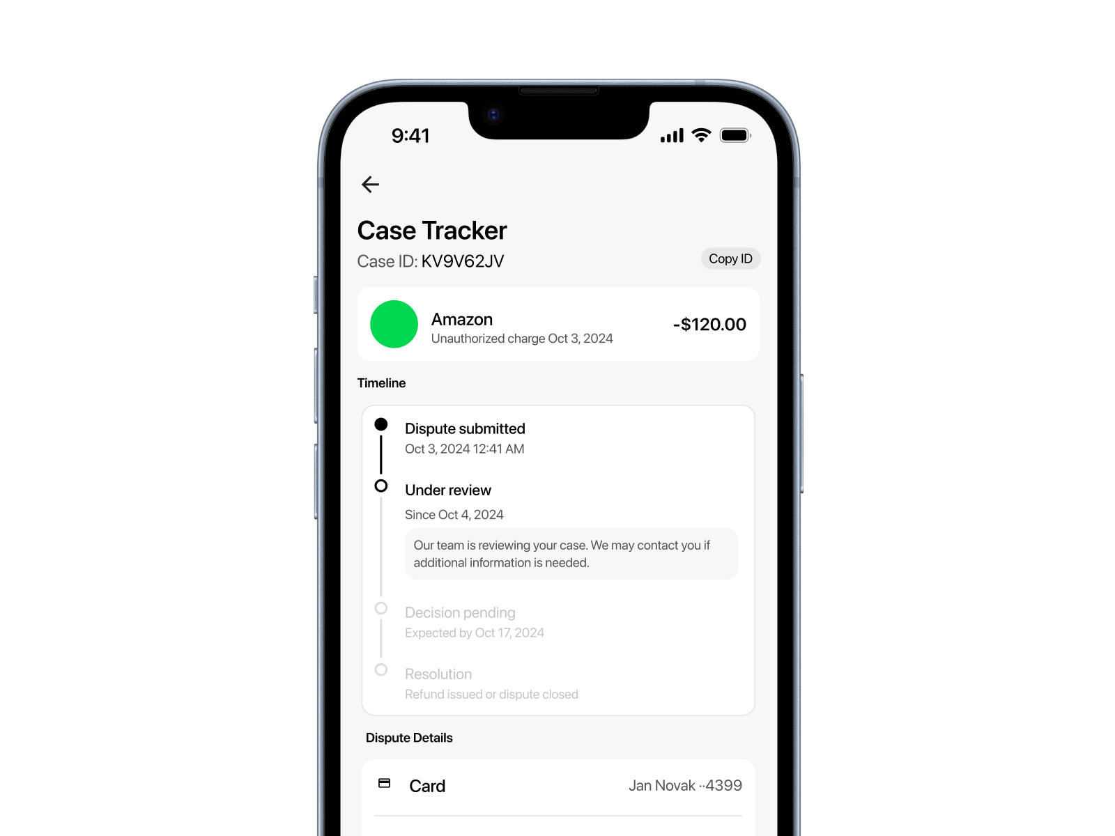
Revolut, N26, and Qonto all surface a visible dispute status tracker inside the transaction. Cash App has no equivalent — users must contact support to find out anything.
Provisional Credit Removes the Biggest Pain Point
Revolut and Qonto both issue provisional credit while a dispute is under review. Cash App does not — leaving users financially exposed for weeks.
Users Under Stress Need Fewer Steps, Not More Options
Users in dispute scenarios hesitate at multi-option screens and abandon flows with more than 3 decisions per screen. Splitting into single-purpose steps reduced hesitation measurably.
Design Direction
How might we show users exactly where their dispute stands at every stage, without ever needing to contact support?
Transparency over Silence
Every state in the flow must communicate something to the user. The system is never quietly doing something in the background without telling the user what's happening.
Every dead end has a door
No screen in the flow ends without giving the user a clear next action. Whether the outcome is good, bad, or pending — there is always somewhere to go and something to do.
Earn trust through actions, not words
Every trust signal must be structural — built into the UI itself. Not written in copy. Not promised in a headline. Shown through a real, functional element.
Design Decisions
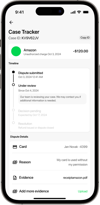
Final Solution
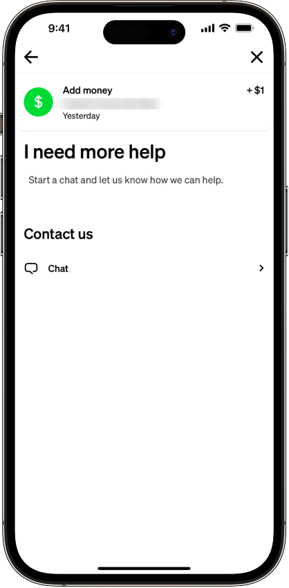
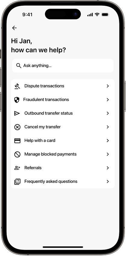
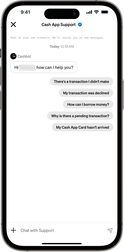
Dispute entry one tap away from any transaction — no hunting, no dead ends.
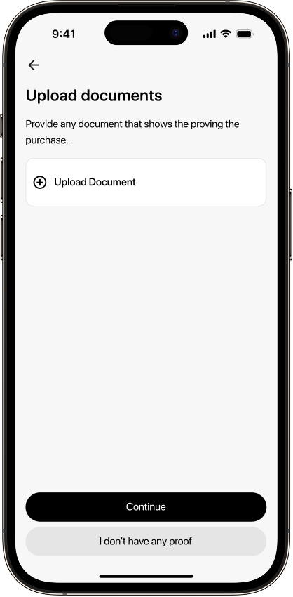
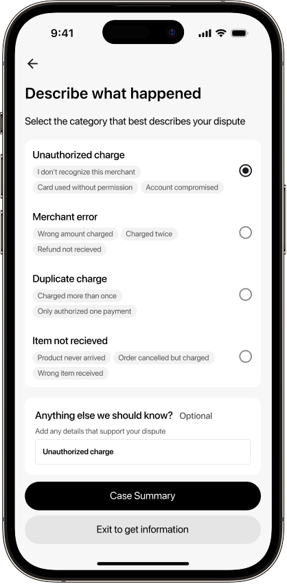
3-step evidence flow — one decision per screen, type-specific guidance throughout.
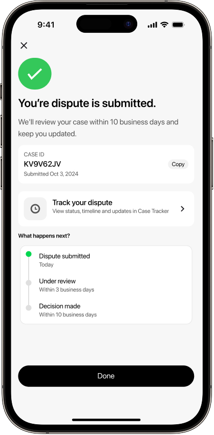
Live case tracker — users see exactly where their dispute stands without contacting support.
Resolution screen for every outcome — approved, denied, or appealed. No screen ends at a wall.
Limitations
Backend infrastructure is out of scope
The provisional credit system — issuing funds back while a dispute is reviewed — was the most impactful trust mechanism identified in competitor research, but requires backend work outside this sprint.
Smart alert banner requires fraud detection signals
The proactive "Does this charge look right?" banner needs anomaly detection from the backend — a technical dependency outside the scope of this design sprint.
Notification and email flows are not covered
The redesign covers the in-app journey only. Push notifications, email confirmations, and SMS status updates are out of scope and would require a separate workstream.
Usability testing was limited in scale
Observation sessions were conducted with 2–3 participants — sufficient for a portfolio case study but not statistically significant.
Next Iterations
- Conduct usability testing at scale — run the dispute scenario with 8–10 participants, measure task completion and time-on-task against the original flow.
- Design the provisional credit system — UI states for issued, pending, and reversed, informed by the technical constraints of implementation.
- Build the notification layer — push and email templates for each case tracker stage change. A dispute flow without proactive outreach still puts the burden on the user.
- Explore the smart alert banner — the proactive "Does this charge look right?" prompt triggered by unfamiliar merchants, the most promising idea from the Crazy 8s phase.
Key Learnings
The biggest UX problems are structural, not visual
Cash App's flow doesn't look broken — it looks like a normal app. The damage is in what's absent: a case ID, a status update, a human escalation path. The research phase was where the real design work happened.
Design principles only work when they're specific enough to create conflict
"Make it simple" never tells you what to cut. "Every dead end has a door" forced the denied resolution screen to include an appeal path — the principle created the constraint, and the constraint created a better design.
Competitor research is most valuable when you document what's missing
Studying Revolut, N26, and Qonto proved that a case tracker, provisional credit, and scenario-specific guidance are solvable — other teams already solved them. That reframed Cash App's failures from inevitable limitations to reversible design decisions.
A focused scope produces a stronger case study than a wide one
Limiting scope to 8 screens meant every decision could be traced back to a research finding. Breadth is easy to fake. Depth is not.