Domani
SaaS Platform
A job application design assignment. One week to deliver a sales landing page, a complex navigation system, and a production-ready component library for an AI-powered restaurant management platform. The result was a hire.
The Brief
Design the landing page and main navigation of a hypothetical AI-powered restaurant management SaaS. The brief asked for three things simultaneously — each of which is a full project on its own.
"The brief asked for a landing page and a product navigation at the same time — which meant designing for two completely different audiences: the restaurant owner being sold to, and the restaurant owner doing the work."
The Problem
Restaurant owners run their businesses across three delivery tablets, a spreadsheet, and intuition. But the product challenge here was double-sided: the platform had to solve the operational problem, and the landing page had to explain that solution clearly enough to close a sale — without a human walking the buyer through it.
Fragmented Operations
Yemeksepeti, Trendyol, and Getir each run on a separate tablet. Menu pricing lives in a spreadsheet. Stock is counted manually. Nothing talks to anything else.
Invisible Food Waste
Restaurants lose 4–10% of food inventory to waste they never catch. No ingredient-level tracking means no alert until the money is already gone.
Menu Decisions Made Blind
With 80+ items on a menu, owners have no data on which dishes generate margin and which drain it. Pricing decisions are based on feel, not numbers.
The Demo Problem
B2B SaaS is complex to explain. The landing page had to demonstrate AI-powered features clearly enough that a restaurant owner — not a tech buyer — could immediately see the value without a sales call.
Architecture & Component System
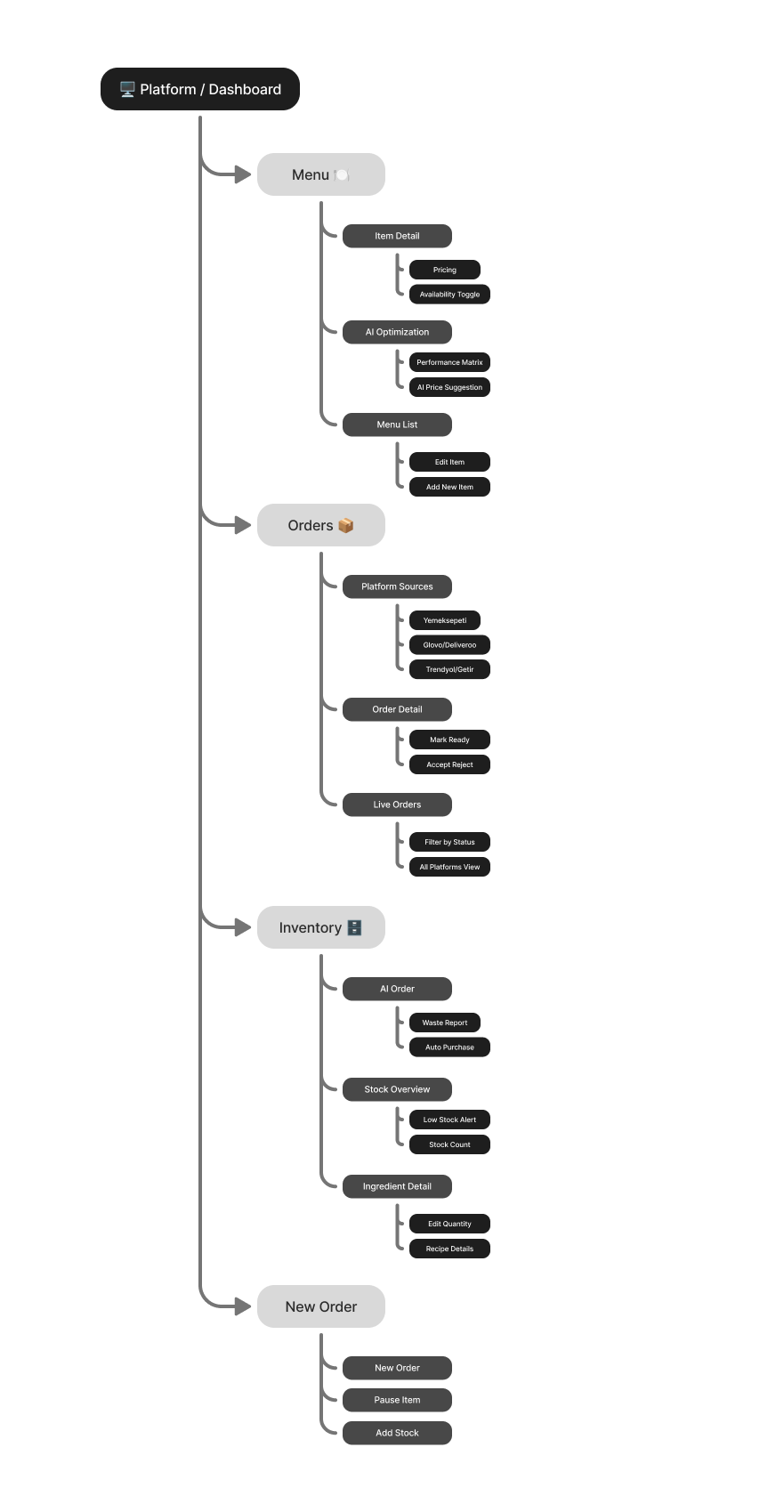
Before designing any screen, I mapped the platform's information architecture. Five modules, one sidebar, two levels of nesting. Every structural decision was made before a component was built — because in B2B, getting the hierarchy wrong at the start means rebuilding everything later.
Information Architecture
The IA settled a question every restaurant platform gets wrong: is taking a new order a task inside Live Orders, or its own mode of work? I designed it as the latter — a dedicated flow, not a button buried in an ongoing view — though the 1-week scope meant it shipped as a single state rather than a fully fleshed-out module (see Limitations). The five sidebar destinations that did ship as persistent, equal-weight modules exist so owners never lose context switching between monitoring a screen and acting on it.
Sidebar Modules
Dashboard, Menu, Orders, Inventory, and Analytics. Each module is a distinct operational context. The sidebar is persistent — owners navigate without losing their place inside a module.
Levels of Navigation Nesting
The brief specifically asked for nested menus. Modules expand into sub-sections (e.g. Inventory → Stock Overview / Alerts / Purchase Orders) without a page navigation. State is preserved on collapse.
Component-First Build Order
Atoms before molecules. Tokens before components. Screens last. Every UI element traces back to a base component in the library — so a developer or designer can change one token and see it cascade across the file.
Component System
Components were built after the IA and before the screens. Design tokens (colour, spacing, radius, type scale) were defined first, then atoms (buttons, inputs, badges), then molecules (cards, table rows, callouts), then full screen layouts. Nothing in the screens was drawn from scratch — every element traces back to a library component.
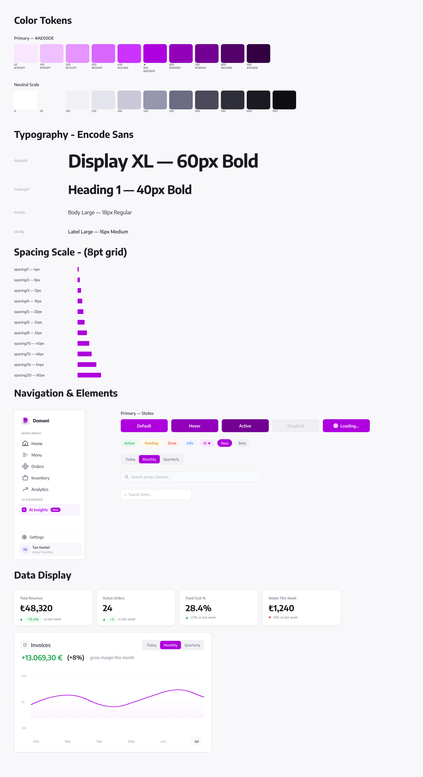
From the decision memo: "Every component is built with auto-layout and detached from content. A designer picking up this file for the first time should be able to add a new screen in under 20 minutes without touching the component library."
Design Direction
Three design challenges were specific to this product — not generic B2B SaaS problems, but constraints that came directly from the brief and the audience.
The Figma file had to meet the same standard as the product
The brief was evaluated by a team that would open the file and maintain it. A developer picking up the file needed to reach the right component in under 3 clicks — the same navigability standard set for the sidebar navigation itself. The system had to work at both levels.
Every restaurant SaaS already says "AI-powered"
The design question wasn't whether to include AI features — it was what AI looks like when it actually makes a decision the user doesn't have to make themselves.
Restaurant owners check the dashboard from a counter laptop
Not a 4K monitor. The sidebar needed to collapse, the data tables needed to prioritise columns, and the card grids needed to reflow — before any screen was finalised. Responsiveness was a layout constraint from day one, not a pass at the end.
Design Decisions
Landing Page
The landing page was designed as a standalone sales system — not a marketing brochure. Every section has a job: the hero earns attention, the pain sections build recognition, the social proof reduces risk, the CTA removes friction. The visual language directly mirrors the product, so the transition from landing page to dashboard feels like a continuation, not a jump.
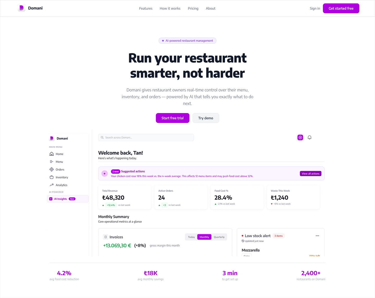
Hero with a clear value proposition — "Run your restaurant smarter, not harder" — plus a stat strip anchoring the product in real outcomes: 4.2% food cost reduction, ₺18K monthly savings.
Three pain-point sections, each pairing a specific problem with a live UI component from the platform — so the buyer sees the solution in context, not in the abstract.
Social proof section with restaurant owner quotes and key metrics — 2,400+ restaurants, 95% retention — placed after the pain sections, not before.
Single CTA repeated twice: once mid-page after the first pain point, once at the bottom. Email input + "Start free trial" — no credit card required.
The Platform
Four core modules, each with its own page structure, data hierarchy, and AI integration point. Every screen follows the same layout system: persistent sidebar, topbar with search, page header with breadcrumb, then content.
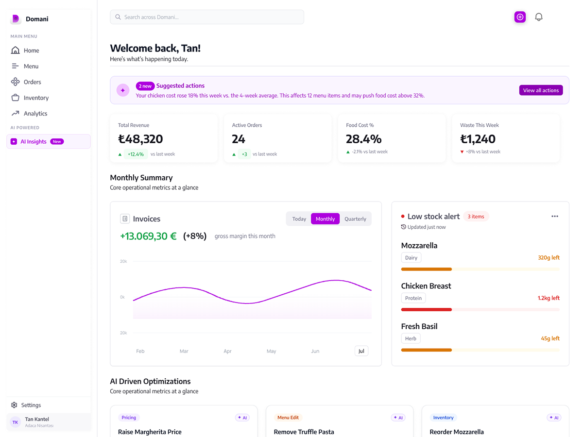
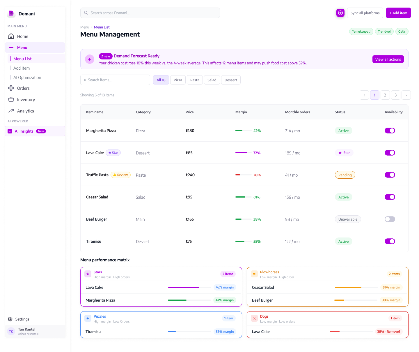
Revenue and order volume data, with the AI Insight Callout surfacing the single most urgent action before the owner reads a chart.
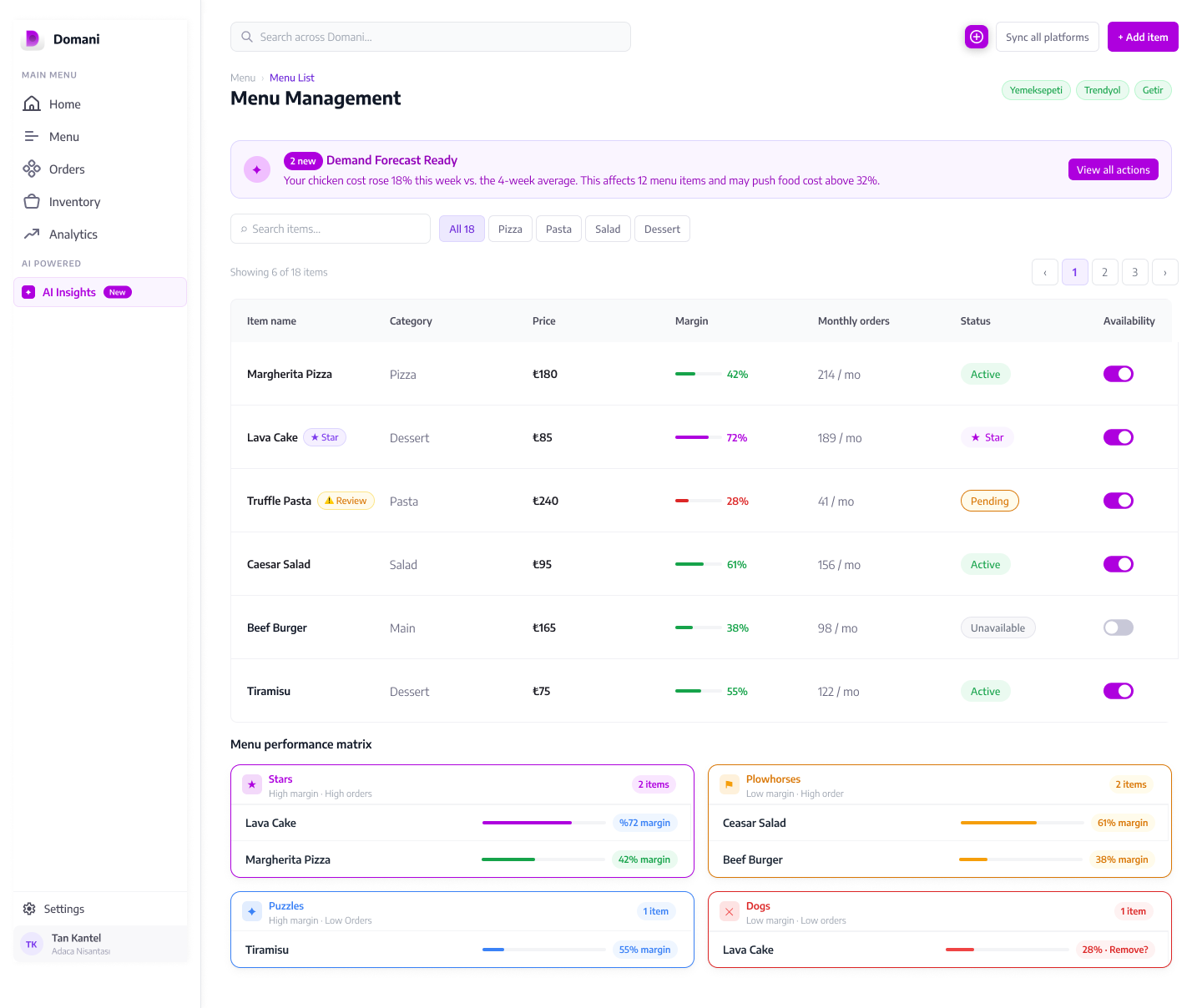
The full menu list sits beneath the performance matrix, where pricing and item details get edited directly — no separate screen, no context switch.
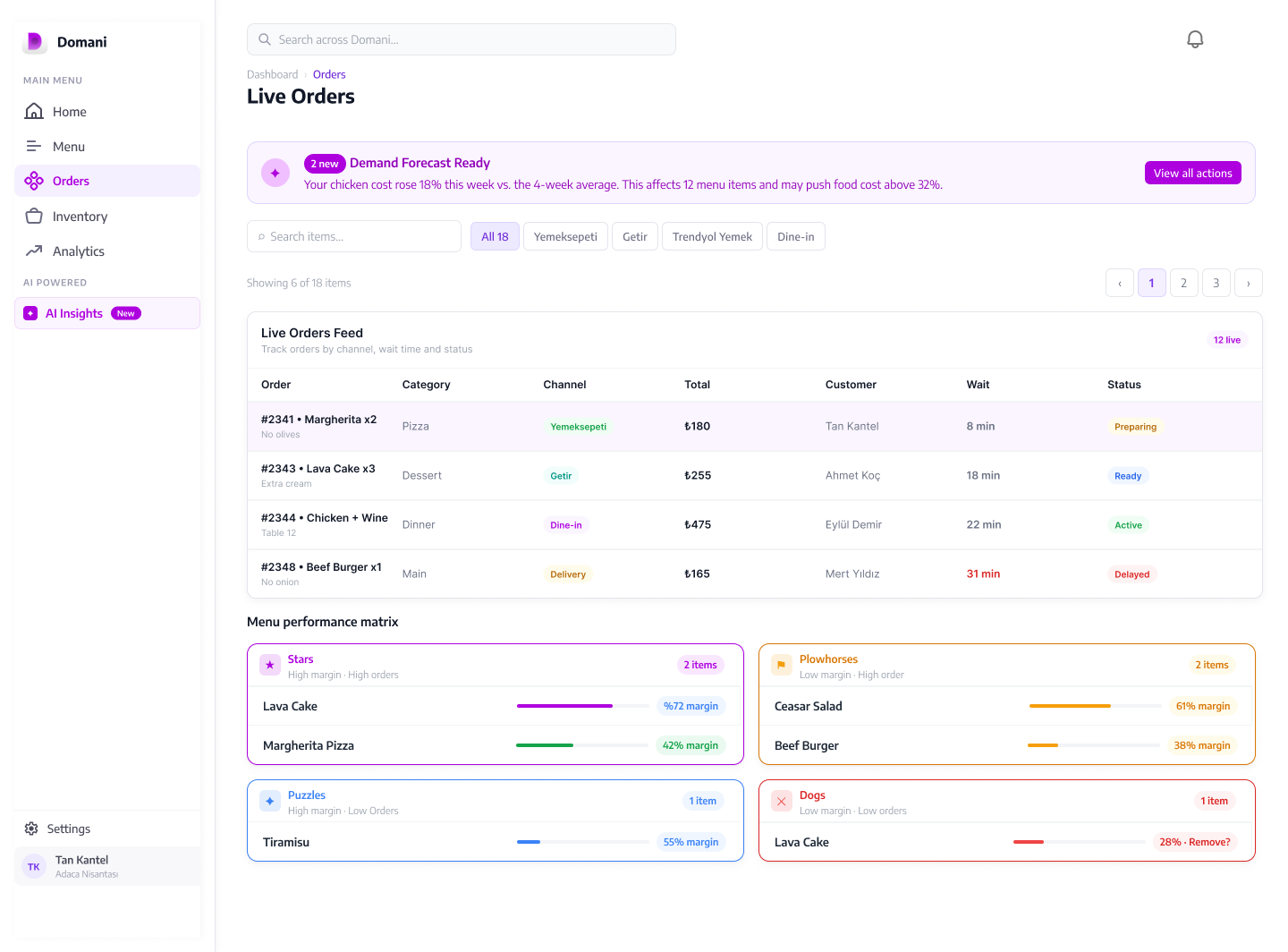
Orders from Yemeksepeti, Trendyol, and Getir are consolidated into a single card-based view. Each card shows platform source, items, and live status at a glance — replacing three separate tablets with one screen that doesn't require the owner to context-switch.
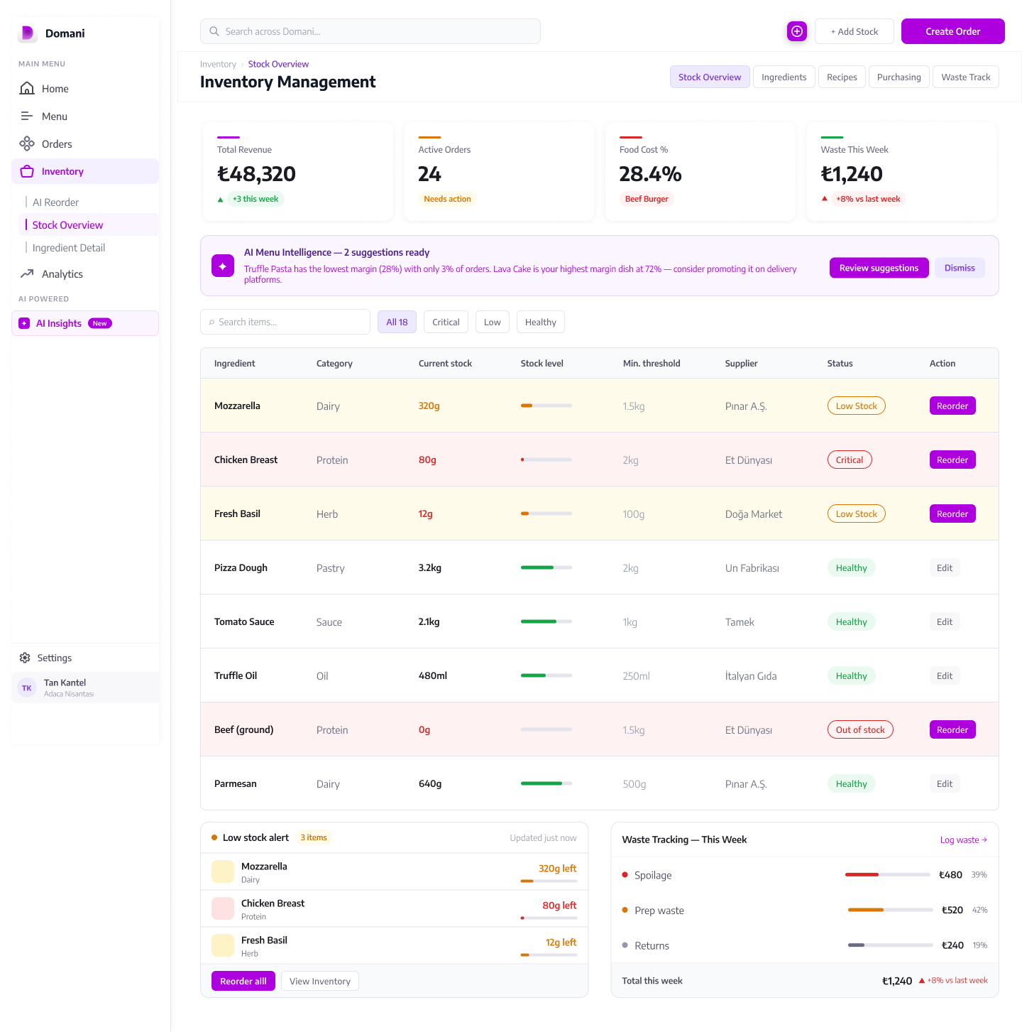
Low-stock alerts are surfaced before the inventory table — not buried inside it. The AI estimates stock-out timing based on recent order volume, so the owner sees "Tomatoes: 2 days left at current rate" rather than a raw quantity that means nothing without context.
The Result
"The file is organised, the component and design system usage is really well executed, and the design is responsive." — Hiring team feedback
This was a speculative brief — no real users were tested and no product metrics were measured. The platform was designed around projected industry benchmarks (food waste reduction, delivery consolidation savings), but those figures reflect the value proposition the product was built to achieve, not outcomes from live usage.
Limitations
1-week scope forced prioritisation
Three major deliverables in one week meant depth had to be balanced against breadth. Some modules — particularly the New Order screen and Purchase Order flow in Inventory — were scoped to a single state rather than all interaction states.
Mobile not in scope
The brief specified a web grid system. The responsive work covers down to 768px (tablet), but a dedicated mobile companion app for kitchen staff was outside the assignment scope entirely.
Landing page numbers are projected, not measured
The stat strip and social-proof figures — 4.2% food cost reduction, 2,400+ restaurants — are sales copy for a design exercise, not measured outcomes. They read like real numbers because that's what a landing page needs to do.
AI logic is a design assumption
The AI Insight Callout and menu classification logic are designed as if the data layer exists. The actual ML model, data pipeline, and accuracy thresholds are product and engineering decisions this design leaves open.
Key Learnings
Structure before screens — always
In a 1-week sprint, the instinct is to open a frame and start designing. The work that made this project succeed was spending the first day on IA and component tokens before touching a single screen. That investment paid back every hour after it.
The landing page and the product are the same design problem
Designing both at once forced visual consistency. The landing page uses actual platform UI components — so the transition from marketing to product feels inevitable, not jarring. Treating them as separate projects would have broken that continuity.
The decision memo is part of the design
Writing the memo forced me to articulate every choice I had made instinctively. Several decisions I couldn't explain clearly enough got revised. The act of writing exposed the gaps that the visual review had missed.
Responsive thinking changes every layout decision
Designing with breakpoints in mind from the start changes what grids you choose, how wide your sidebar is, and how many columns your cards span. Retrofitting responsiveness at the end is expensive — and it shows in the final work.