Piki
Mobile ordering application for a local beer garden designed to minimize queue congestion and ordering errors during peak periods.
The Problem
Peak hours at the beer garden brought long queues, order confusion, and difficulty modifying items at checkout.
Order confusion & editing
Customers couldn't modify orders easily once placed, causing friction at the point of service.
Long queues
Physical queuing during peak periods created a poor experience and deterred potential customers.
Staff overwhelmed
High volumes of physical orders created cognitive overload and increased error rates for staff.
Order abandonment
Customers hesitated to complete orders when changes were needed, leading to abandonment.
"Designing for high-energy environments requires system-level thinking. Reducing psychological friction at the interaction level directly impacts operational efficiency at the service level."
Research Insights
Study group: N=12 city inhabitants. Four key patterns emerged from qualitative and observational research.
Digital Preference
A significant majority expressed definitive preference for digital queueing over traditional physical attendance. Qualitative data showed wait times of 5–30 minutes in physical queues.
Peak-Hour Impact
Wait times consistently peak during high-traffic intervals, leading to measurable decline in service satisfaction scores.
Staff Stress
Physical crowding creates high-pressure cognitive load for onsite operators, resulting in increased error rates and reduced service quality.
Loyalty Connection
The shift to asynchronous ordering allows users to reclaim high-value time, directly correlating with brand loyalty and return visits.
Design Decisions
Final Solution
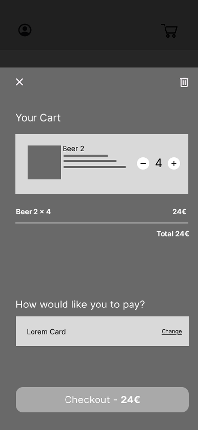
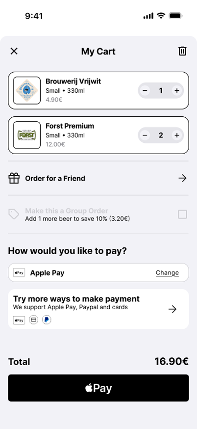
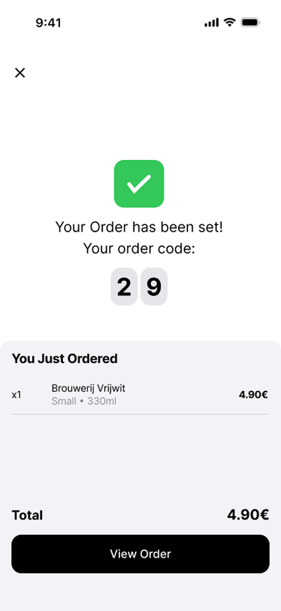
Easy removal without leaving checkout flow, reducing abandonment at the final step.
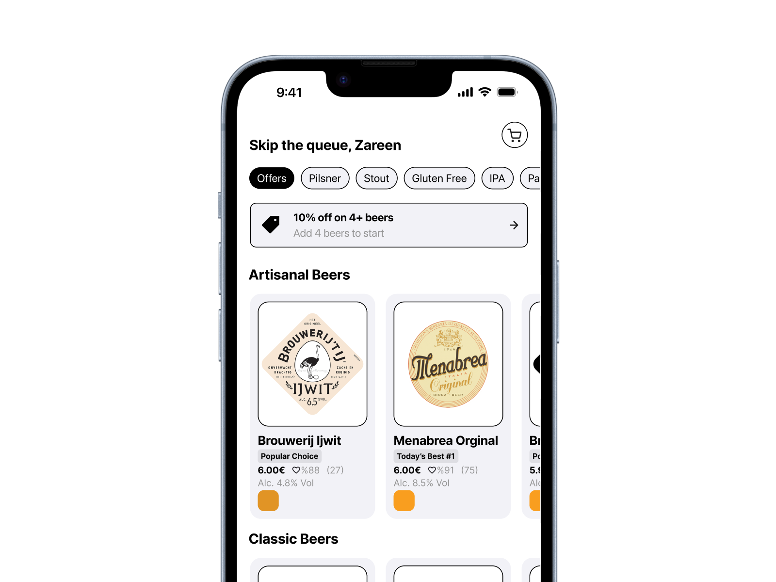
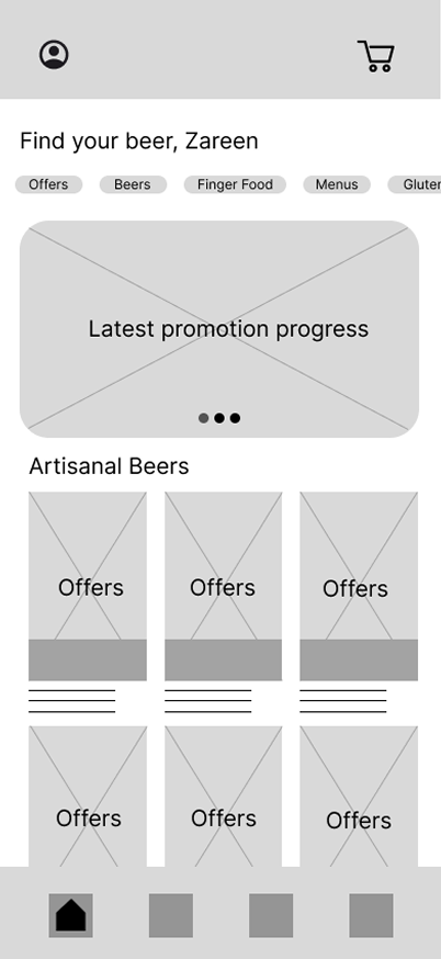
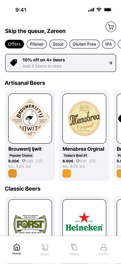
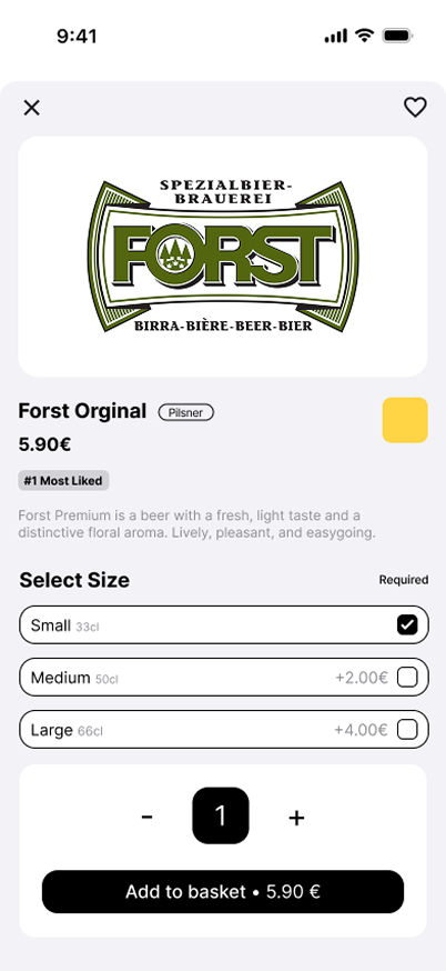
Category-based navigation designed for rapid scanning in high-noise environments.
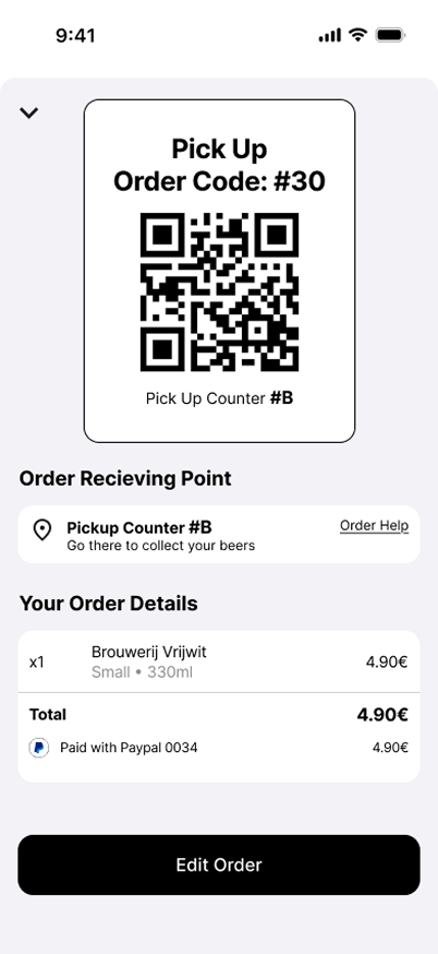
Live pickup communication to reduce confusion around order status.
Order collection zone information displayed prominently for first-time users.
Outcomes
Limitations
Environmental Variables
Testing was conducted in a controlled setting. The prototype hasn't been validated against high-density crowd noise or environmental stressors of physical peak hour.
Operational Blindspots
Current scope focused solely on customer-facing UI. Back-of-house operational flow remains a critical area for future validation.
Service Ecosystem
While the digital order phase is optimised, the end-to-end service journey — specifically physical hand-off and pickup — requires holistic testing.
Next Iterations
- Design and test the staff-facing interface for order intake and preparation
- Measure actual peak-hour throughput improvements versus physical queues
- Conduct in-environment usability testing under real event conditions
Key Learnings
System-level thinking
Considered the full operational ecosystem — not just individual screens — to identify where design creates the highest leverage.
High-energy context
Accounted for the pressures of fast-moving, noisy environments where cognitive load is already high.
Psychological friction
Identified and reduced mental load at each interaction point — from menu navigation to checkout confirmation.
Operational efficiency
Linked every UX decision to a measurable service-level impact, ensuring design served both users and operators.